
"There are a lot of novels out there that make you think America is England, you know?" responds Hannaham, describing the type of fiction he deliberately didn't write. "That book is sort of—it's dark green, and there's a very sort of sensuous but depressing-looking cover: a photograph, there's like a blurry thing in the distance. It's a beach maybe, and the title describes a relationship between a mother and a daughter, or a mother and a father, or a father and a daughter. And the typography is all done in the same typeface as money, and the interior is all about small lives lived in a small way. I've often felt like those books don't have much to do with the way life is actually lived in America." (— interview in the Village Voice)
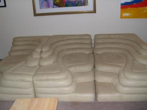 Funny and true! If I remember correctly from meeting him in Austin at AWP a few years ago, he's also the man behind Revolting Sofas, a blog of terrible sofa pictures harvested from Craigslist with accompanying mini-stories by various authors. I tend to skim the stories and gawk at the sofas, some of which are merely trashed and some of which give me a weird crawling feeling just looking at them.
It's hard for me to even have that one sofa there. I feel like its creepy pale ripply surface is contaminating the whole post. I have to tip the balance by putting in more photos. Such as:


an overweight hedgehog (thank you Gail), my childhood dog Shady (1985-1998) swimming in the lake,


a rock that looks like a monster at the Oregon coast, and my beloved friends Brock and Nick after breakfast in Portland.
That feels better.
Here too is the cover of James Hannaham's book, which officially hits the shelves next Tuesday.

No comments:
Post a Comment